The logo

For obvious reasons (to people who know my name) I did not want to use my surname or maiden name in my logo for the blog and portfolio website.

I did want to use my first name somehow but my first name is often misspelled. So I used a thick rule under the last 6 letters, to emphasize the correct spelling.

The logo is inspired by typefaces used in Holland around 1910 to 1930.  I didn’t want the logo to be too decorative, it had to be a solid, not too feminine word mark. I found the font Kurversbrug, which is inspired by the cast iron letters found on the bridges of Amsterdam and found it to be quite suitable for its purpose.

Adjusting the CSS

I have just upgraded to the editing CSS feature of WordPress, so that I could adjust the colours and fonts of my blog. The colours are now in line with my portfolio website, which I am currently developing.  I am exited about the fact that I am using CSS in a slightly different way now, and that it is actually working…hahaha.

Wendingen

Here a short introduction to a Dutch Art magazine published from 1918 to 1932. The reason why I really enjoy looking at the front pages of this Magazine, is because the magazine was linked to architect association Architectura et Amicitia. (Architecture and Friendship). The typographic style used and the images used, remind me of Dutch architecture.

Wendingen (Dutch:Inversions / Upheaval) was an art magazine that appeared from 1918 to 1932. It was a monthly publication aimed at architects and interior designers. The booklet was published by Amsterdam publisher Hooge Brug and it was a mouthpiece for the architect association Architectura et Amicitia. (Architecture and Friendship). The chief editor was the architect H. Th. Wijdeveld. Wendingen initially was an important platform for Dutch expressionism, also known as the Amsterdam School, and later endorsed the New Objectivity.

In spite of the link of Wendingen with an architect’s association, the contents of the booklet were not limited to architecture but attention was also given to art and design. The magazine gained recognition not only through its content but also by its remarkable square format and the striking typography of architect H.Th. Wijdeveld, El Lissitzky, Vilmos Huszar and others. (Source:Wikipedia)

You will find some more information on this website. It is in Dutch, so good luck.

http://www.geheugenvanplanzuid.nl/archief/architectuur/wendingen.htm

Responsive website portfolios

I have started researching for my next assignment, and that is to create a responsive portfolio website. First thing to do is to look around and see how other designers are presenting themselves online.

I have found some great inspiration on the following websites:

http://www.hongkiat.com/blog/responsive-portfolios-for-inspiration/

http://www.graphicdesignblender.com/50-responsive-freelance-portfolio-sites-to-help-you-master-mobile

http://ibrandstudio.com/inspiration/35-beautiful-responsive-portfolio-websites

My first conclusion is, to keep things simple. When you want to present different projects with the use of thumbnails, you really want the basic lay-out to be simple, with not a lot of colour or graphics in the background.

I am working on a logo to use to present my very hard to spell name: Marieke, Marika, Marieka, Mareka, Merika.  I will update you on the logo process in the coming few days.

The Type Hunter

Hi guys,

Besides typography I have another passion, and that is a passion for old stuff; antiques, or nearly antiques, especially old stuff with type on it. In today’s post I want to introduce you to a guy who shares this passion with me.
Keith Tatum The Type Hunter. Check out his work on Behance
He also has a wicked Instagram, so start following him today!!
The video here, shows you his work space. Very inspirational.
Have a great week!

Ale Paul

ImageAle Paul

Hey guys,

Today I want to introduce you to the work of this happy guys here; Ale Paul.

Ale Paul is one of the founders of the Sudtipos project, the first Argentinean type foundry collective. Go and check it out. You will find some amazing scripts there. Sudtipos

Ale’s career as an art director landed him in some of Argentina’s most prestigious studios, and handling such high-profile corporate brands as Arcor, Procter & Gamble, SC Johnson, Danone, and others. With the founding of Sudtipos in 2002, Ale shifted his efforts to typeface design, creating fonts and lettering for several top packaging agencies, along with commercial faces.

His work has been featured in publications around the globe, including CommArts, Print, Step, Creative Review, Visual, Creative Arts, Novum, and many others.

He has walked away with awards from numerous design competitions. He has received four Type Directors Club TDC2 awards, in 2008 for Burgues Script, 2009 for Adios Script, 2011 for Poem Script and recently Hipster Script in 2012.

His typefaces design Piel Script recently received a Letter2 competition award as one of the best fonts of the decade.

He teaches a postgraduate typography program at the University of Buenos Aires, where he previously taught graphic design. He was designed ATypI’s country delegate.

Since 2012 is a new member of the Alliance Graphique Internationale.

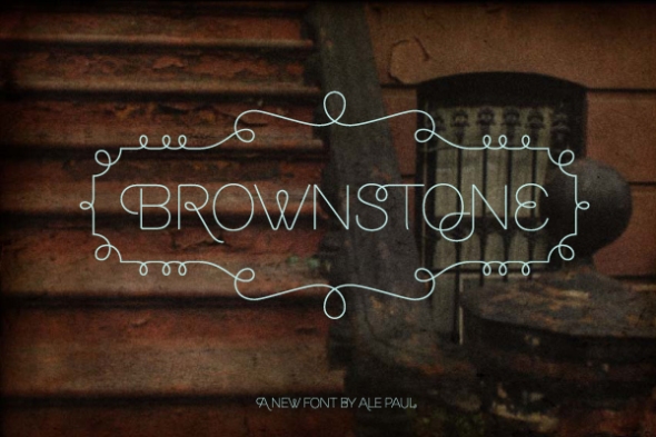
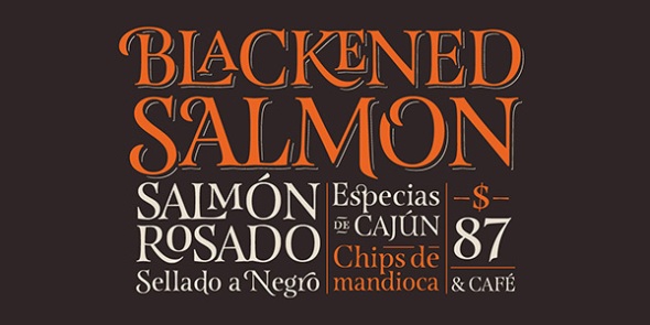
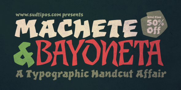
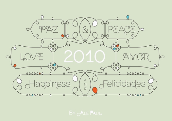
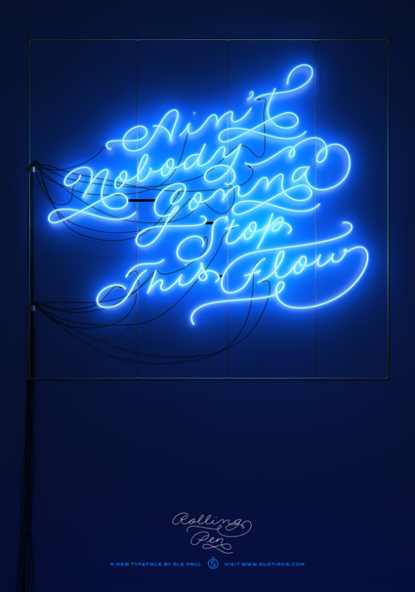
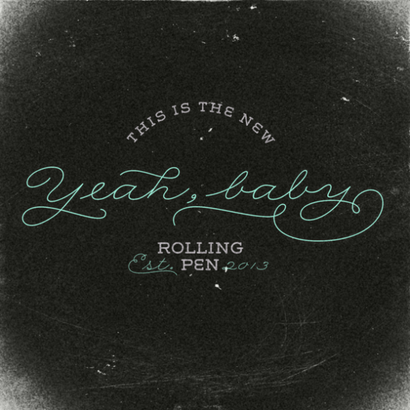
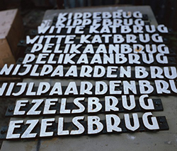
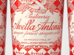
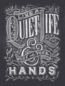
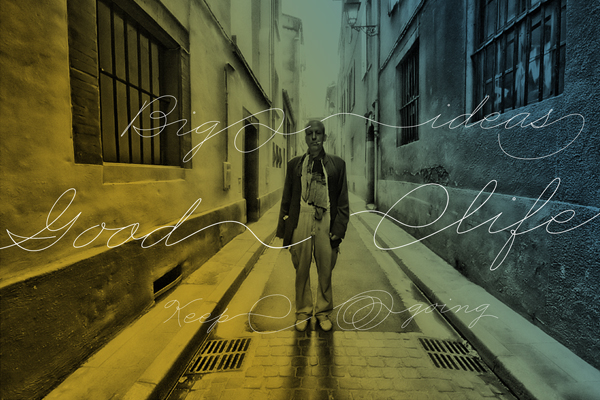
Here you will find a little impression of his work. If you want more go to his website which you will find here.

Image

ImageImageImageImageImage

Image